
Designing Flourish, a more thoughtful way to understand how your cycle affects everyday life
Timeline
Fall 2025 - Winter 2026, Thesis
Role
UX / Product Designer
Team
3 designers
Focus
User research, Product Thinking, Interaction and UI Design, Design Systems
My contribution
I helped translate user research into the product experience, refine Flourish's core concept, design key flows and interactions, and contribute to the component/design system as the product evolved.
01 / The problem
People feel changes all month, but understanding them isn't straightforward.
"Why am I so tired today?"
"Is this normal for me?"
"Should I actually change what I'm doing?"
Cycle apps are good at recording dates and symptoms. Flourish explored a different question: what if cycle information helped someone understand their everyday patterns, instead of just recording them?
02 / Where we started
Original hypothesis: help people sync their habits and lifestyle to the four phases of their cycle.
We assumed the value would come from recommending what to do in each phase: what to eat, how to move, when to rest, when to push. The early home screen reflects that. It told you what "you" typically feel in the luteal phase, followed by things you might like and things to avoid.
Then research made it more complicated.

Lo-fi home
03 / What I needed to understand
Before designing further
1
Do people actually notice recurring changes across their cycle?
2
Do they understand why those changes happen?
3
Would phase-based recommendations feel helpful, or restrictive?
4
What information would actually help with everyday decisions?
Two surveys (the second with 24 participants) plus secondary research from sources like ACOG and Cleveland Clinic.
04 / Research to insight
Four findings that changed the product
What we heard
83%
notice monthly patterns
53%
don't know the phases well
"I don't actually know what it entails when my period is over."
What this meant
People notice patterns. They don't understand them.
Showing someone which phase they're in wasn't enough.
Design implication
Explain why you might feel different, right where you notice it: inside each symptom, on each phase card, in short articles.
What we heard
"Consider that I have PCOS, there aren't set patterns."
"Most cycle apps I've used don't have options for all the different birth controls available."
What this meant
A textbook cycle doesn't fit everyone.
People with PCOS or on birth control said predictions often feel inaccurate.
Design implication
Ask about birth control and health conditions in onboarding, and give birth control, PCOS and PMDD their own tracking categories.
What we heard
50%
want help with planning and focus
50%
want emotional support
What this meant
People weren't looking for another tracker.
They wanted support, not more logs.
Design implication
Make logging lead somewhere: logged symptoms show up on your day and your home screen, and the journal offers prompts.
What we heard
37.5%
want gentle reminders only
Too many notifications were frustrating. People preferred fewer, more meaningful ones.
What this meant
Being told what to do gets old fast.
Design implication
Guidance should invite, not instruct. That became a rule for how every phase card and tip was written.
05 / The pivot
We stopped designing around what users should do, and started designing around helping them understand themselves.
Early
Phase
↓
Generic recommendation
↓
"Typically you feel like this during the luteal phase." Things to avoid: high sugar, caffeine, alcohol.
→
Evolved
What you logged
+ cycle context
+ why it happens
↓
"Your typical symptoms during the luteal phase": cramps, feeling sad, acne, heavy flow. Tap one to learn why it happens.
Research pushed us away from rigid cycle-syncing rules. Our own Miro notes put it plainly: use research about the phases, but don't make everything specific to the phases. Flourish became a tool for awareness, connecting mood, energy and symptoms with cycle context without treating every body as identical.
06 / Designing the experience
Challenge 1
Making cycle information understandable
Early / A progress arc and a generic list

Final / Where you are, in one glance
Our planning notes named the cycle day tracker "the biggest thing". The final home answers three questions in order:
Where am I?
A week strip with today's cycle day and the predicted period, plus countdowns to your next period and ovulation.
What phase is this?
"Currently in: Luteal" is the largest thing on the screen.
What does it mean for me?
Your own typical symptoms for this phase, then a phase timeline to learn more.
Challenge 2
Turning tracking into reflection

Input
Log across categories built for real bodies, including birth control, PCOS and PMDD.

Interpretation
Each symptom explains itself while you log it: "strong cramps are most common during your period when prostaglandins cause the uterus to contract more intensely."

Useful output
Your logs come back on your day, next to a tip and a phase guide, and roll up into "your typical symptoms" on home.
Challenge 3
Giving guidance without sounding prescriptive
Early phase copy
"Estrogen levels are low (you may notice increased irritability, sadness, anxiety, and mood swings), while abdominal pain and low energy are common."
Accurate, but reads like a list of what's wrong with you.
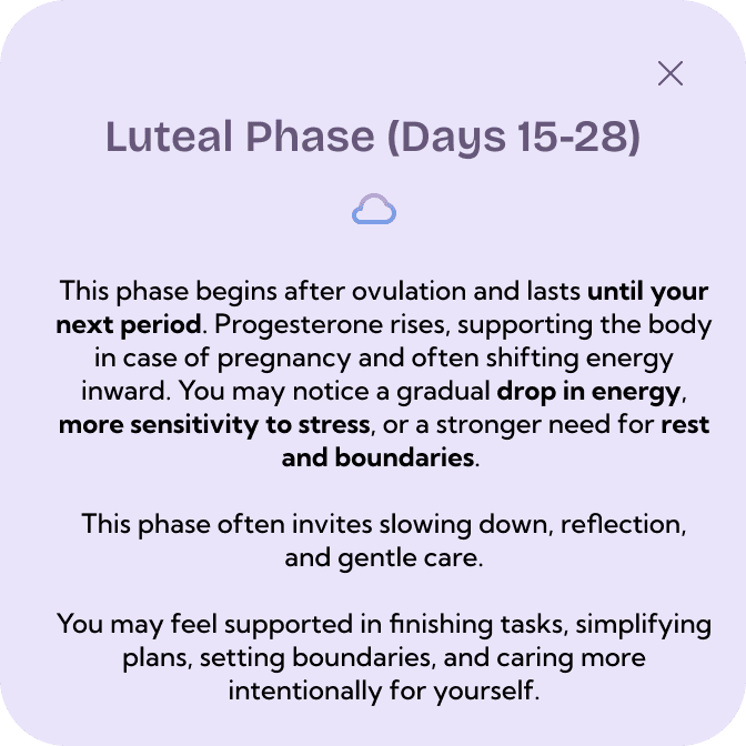
Final phase copy
"You may feel more tired, stressed, or emotionally sensitive during this time. This phase invites rest, release, and gentleness with yourself."
Same facts, framed as permission instead of a diagnosis.
The rules behind the copy:
"May" and "might", not "will". Bodies vary, so the copy does too.
Suggest, don't instruct. "Consider incorporating magnesium-rich foods" rather than "eat this".
Show the source. Articles explain why it happens and cite where it came from, like ACOG's PMS guidance.
07 / Iterations
What changed, and why
Home

V1 / Lo-fi
Not working: a progress arc showed the cycle day, but not when your period or ovulation would land.

V2 / First hi-fi
Changed: a week strip with cycle day, predicted period, and countdowns. Not working: white text on the light gradient was hard to read.
Final
Why: we flagged "change the colours to be more accessible" and moved key text to our dark #2E164B.
Symptom tracking

V1 / Lo-fi
A checklist of categories to track.
"Add notes to each symptom!!!"
Testers also asked for spotting, sex life, social life, collection method (pad, tampon and more), hair and digestion.
What testing told us
Final
Why: new categories plus a notes field on every symptom, so people could record what the presets missed.
08 / Design system
Keeping it consistent as it grew
Every round of testing added categories, symptoms and phase content. Turning repeated UI into components meant each addition slotted in without redesigning the screens around it.
Bricolage Grotesque
Kumbh Sans for body and cards
Components
Four phase cards
Phase icon buttons
Symptom icon sets per category
Onboarding dropdowns, nav bar
Patterns
Symptom sheet: icon, why it happens, slider, notes
Logged-symptom row
Phase explainer
Screens
Home, calendar, symptoms, journal, articles, profile
When testing added social life, sex life and collection method, each became a new icon set and reused the same symptom sheet.
09 / The final experience


Understand where you are
Notice what you're experiencing
Connect recurring patterns
Make choices that work for you
10 / Validation
What we validated, and what still needs testing
Observed
Changed
Status
Testers wanted to add context to symptoms
Notes field on every symptom
Shipped in the prototype
Categories didn't cover spotting, sex life, social life or collection method
Added all four
Shipped in the prototype
Text on the gradient was hard to read
Darker key text
Shipped in the prototype
The cycle bar wasn't clear, and home felt like a lot of info
No change documented yet
Needs another round
Tapping a symptom on home went back to the category list instead of opening it
No change documented yet
Needs another round
What held up
"Concept of app makes sense." Testers liked the colour-coding for each phase and the legend, and one went straight to learning about the phases from home.
What I'd question
"Things to avoid" on home (high sugar, caffeine, alcohol) is still the most prescriptive part of the design, and I'd want to test how it lands before keeping it.
11 / What I'd do next
Personalization
How much history does Flourish need before it should make a personal observation?
Trust
How do we clearly separate educational information from individual health advice?
Long-term value
Does recognizing patterns actually change how people plan around their cycle?
12 / What changed how I design
Personalization doesn't always mean more recommendations. Sometimes the better experience is giving people enough context to form their own understanding.
Our first concept assumed cycle syncing meant telling people which habits fit each phase. Research challenged that, and pushed Flourish toward reflection. I kept going in that direction afterwards with Cycle Sense, a small reflective experience built from the same research, with no metrics and no right answers.
Thanks for stopping by!
Leah Benjamin © 2026
Portfolio