
Adding landmarks to Google Maps walking directions, so transit transfers make sense on the street
Timeline
March to April 2025
Role
UX Designer, Solo
Course project
Tools
Figma, Miro, Google Forms
Focus
User research, feasibility, interaction design, prototyping, motion
Overview
Toronto riders trust Google Maps to get them to the right stop, until they come up from the subway and the blue dotted line doesn't match the street in front of them. On my own, I researched where transit navigation breaks down, narrowed the scope with class feedback, and designed a small addition to the existing flow: walking directions that point to the places people actually look for.
43
riders aged 18 to 29 surveyed on Google Maps transit navigation
63%
had been confused about where to catch a streetcar or transfer
32
riders in a second survey testing the landmark idea
97%
said landmarks would make directions easier to follow
01 / The problem
The route is right. The rider still ends up on the wrong corner.
Streetcar stops in Toronto often sit mid-street, on either side of a busy road, with signs that are hard to spot from a subway exit. Google Maps gives a distance and a blue dotted line, which only works if you already know which way you're facing.
Google Maps today
Walk 6 min (400 m)
College St at Augusta Ave
Before / A distance and a destination
Tells you how far, not which way, or which side of the street the stop is on.
Walking directions to 506 streetcar
Walk straight for 90m. You'll pass "Wanda's Pie in the Sky" on your right.
Board the 506 at College St and Augusta Ave, in front of the "Second Cup".
After / Directions you can check against the street
Same route, with street names kept and landmarks added, so each step can be confirmed by looking up.
02 / Why it matters
For riders
A wrong turn at a transfer can mean a missed streetcar and another wait.
The stressful part of a trip isn't the ride. It's the few minutes between two vehicles when you're not sure you're in the right place.
For Google Maps
Transit riders have alternatives, and each one has a reason to switch.
Google Maps already has the most features and the largest database of places. Using that data for walking directions is an advantage no competitor has claimed.
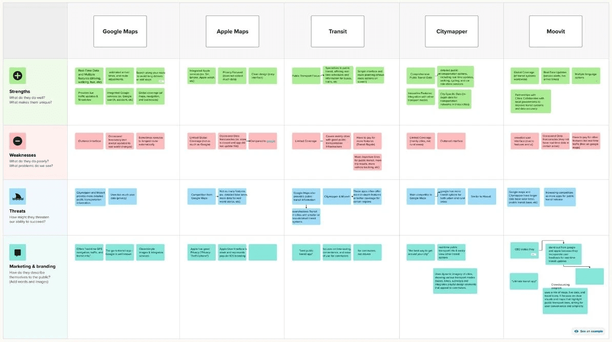
Competitor analysis / Strengths, weaknesses, threats and branding
Google Maps
Most features and the widest database, but a cluttered interface.
Apple Maps
A cleaner UI, with less coverage.
Transit and Citymapper
Built for commuters, with limited coverage outside major cities.
Moovit
Crowdsources live transit updates from riders.
None of them use landmarks in walking directions.
03 / Research
Riders said the directions were clear. Then most said they'd gotten lost anyway.
I surveyed 43 riders aged 18 to 29 on how they navigate transit with Google Maps. The most useful finding was a contradiction.
What I heard
70%
rated streetcar directions clear
63%
had still been confused where to catch it
What it meant
Directions make sense on the screen and fall apart on the street.
The problem isn't reading the route. It's matching it to what's in front of you.
Design focus
Don't redesign the route overview. Help at the moment riders are standing on the sidewalk.
What I heard
44%
had run into streetcar problems, like missed stops or unclear transfers
What it meant
Streetcar stops are the hardest part to find.
Most confusion happened after leaving the subway, not on board.
Design focus
Use the subway-to-streetcar walk as the core scenario.
What I heard
"the stops can be wrong, times are wrong, inaccurate stop location"
"It isn't always updated with detour routes"
What it meant
A common complaint wasn't one design could fix.
Live accuracy depends on the data the TTC shares, not the interface.
Design focus
Treat live tracking as supporting, and put the effort where design could make a difference.

Survey 1 / 43 responses
04 / Narrowing the scope
Class feedback told me which idea was worth building
My early brainstorm covered a lot of ground, from making streetcar stops bigger on the map to fixing live updates. I presented my wireframes and concept in class, and the reaction was clear: classmates kept coming back to the detailed walking directions, and how much they'd help getting from a subway exit to a streetcar sign.
So I dropped the rest and focused on that one feature. Before designing further, I ran a second survey to check whether landmarks specifically were what riders wanted.
Brainstorm problems
Riders struggle to find streetcars in transit apps. Walking directions are hard to follow because they aren't descriptive.
Early idea, dropped
Make streetcar stops larger and more distinct on the map.
After class critique
Detailed walking directions, from the subway to the streetcar stop.
05 / The opportunity
What if walking directions pointed to places riders already recognize, instead of streets they have to look up?
People give each other directions this way all the time: "the stop is in front of the café." If Google Maps did the same, riders could check each step against what they see, instead of against a compass.
06 / Validating the idea
Before designing anything, I checked whether landmarks would actually help
A second survey with 32 riders, mixing closed and open-ended questions, tested the idea on its own. I also looked for research outside my own surveys.
97%
said landmarks make directions easier (31 of 32)
72%
would feel more confident using them (23 of 32)
Landmarks riders want
Coffee shops, restaurants and familiar retail chains
When landmarks help most, in riders' words
"yes it helps when there are two sides of a street"
Exactly the streetcar problem. Became the last step: which stop, in front of what.
"There needs to be both landmarks and street names"
So landmarks were added to street names, never used to replace them.
"…instead of walking around trying to follow the blue dot"
Confirmed the blue dotted line as the weak point in the current flow.
"when street signs may be in a different language"
A use case beyond commuters: visitors and newcomers to the city.

Survey 2 / 32 responses
Secondary research
Studies back this up too.
A study I found on ScienceDirect showed that people given landmark-based instructions built a better picture of their surroundings, and remembered the route better, than people given street-based ones.
07 / Can Google actually do this?
A concept is only worth pitching if the data already exists
I researched where Google Maps gets its information. Two of Google's own APIs already cover both halves: the Places API knows what's on the street, and the Directions API knows the route. Together, they can surface landmarks along a walking path without Google building anything new.
Places API
What's on the street
Businesses and points of interest, with photos and hours
+
Directions API
Where the rider is going
Walking and transit routes, with waypoints and distances
→
Combined
Directions with landmarks
"You'll pass Wanda's Pie in the Sky on your right"
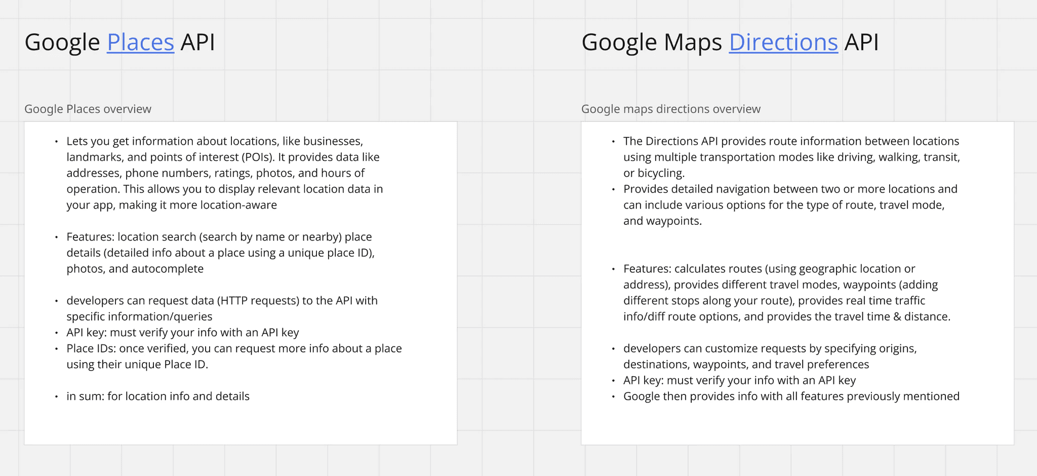
Feasibility notes / Places API vs Directions API
08 / What I chose not to design
Inaccurate live updates came up again and again, and were out of reach
Riders kept describing wrong stop locations, wrong times and detours that never showed up in the app. That accuracy depends on the GTFS Realtime feed transit agencies share with apps, and limited TTC data caps how precise any interface can be.
Moovit gets around this by letting riders report delays themselves. It helps, but only with lots of active users, and it sits outside Google Maps' data. A redesigned screen on top of the same feed would have looked like progress without changing anything.
So I kept live tracking as a supporting feature and spent my time on the walk, where design could make a real difference.
In scope
Clearer walking directions between transit legs, using data Google already has.
Supporting
Live progress once you're on the streetcar, using the existing feed.
Out of scope
Fixing real-time accuracy. That's a data problem, not an interface one.
09 / Fitting into the existing flow
One new button, and nothing new to learn
I mapped the current transit flow first and marked where it breaks: a route that mixes walking and streetcar, and a blue dotted line with no written detail. The only change is a Walking Details button at that point. Riders who don't need it never see it.

User flow / Pain points in pink, the new Walking Details step in purple
10 / From lo-fi to hi-fi
I tested where landmarks should live before deciding how they'd look
At low fidelity I focused on placement: when riders switch modes, when a landmark helps most, and how to add detail without making the default map busier. The structure held up, so hi-fi changed the details, not the flow.


Lo-fi / Validating placement


Hi-fi / Same structure, native Google Maps look
The entry point moved into the route card
Details now sits on the walking leg itself, next to a map button, using a pattern Google Maps riders already know.
The map and the text point to the same places
Each landmark in the steps appears as an icon on the map, so riders can check one against the other.
Landmarks came from the real route
The lo-fi used a placeholder chain. The hi-fi uses the businesses actually on Augusta Ave, like Second Cup, which riders named as the kind of landmark they'd look for.
Thanks for stopping by!
Leah Benjamin © 2026
Portfolio
11 / The final prototype
A full trip to Bloom Cafe, on the 506 streetcar
1
Search for Bloom Cafe and pick the route with the 506 streetcar
2
Start navigation and tap the map button on the walking leg
3
Follow landmark-based steps to the stop, then tap Continue Journey once you're there
4
Watch live progress on board the streetcar
5
Arrive, and rate how the navigation went
The moving location dot on the streetcar was my first animation in Figma, modelled on how Google Maps already shows progress during a trip.
12 / Looking back
What went right
Checking the idea before designing it. Class critique narrowed the scope, the second survey showed riders wanted landmarks, and the API research meant I wasn't pitching something Google couldn't build.
What I'd question
Both surveys asked whether landmarks sounded helpful, not whether they helped in practice. Businesses also close and move, and a landmark that's gone could be more confusing than a street name.
13 / What I'd do next
Test it on the street
Do riders reach the right stop faster, with fewer wrong turns, at a real transfer?
Trust
How should the app pick landmarks that are open, easy to see and unlikely to change?
Voice
The lo-fi had an audio button. Research says spoken landmarks are easier to remember, so I'd bring it back.
14 / What changed how I design
The most-requested fix isn't always the one design can deliver. Picking the problem I could actually solve made the concept stronger, not smaller.
This was an early project, and it's where I started checking feasibility before polishing screens. I've carried that into Auro and Flourish: understand the constraint first, then design inside it.
Next project