Designing Auro, a money app that doesn't make students feel worse
Timeline
May 2026 to present
Role
Product & UX Lead
Team
Four Co-Founders
DMZ Basecamp, TMU
Tools
Figma, FigJam, Claude Code
HTML prototypes
Overview
I led product and UX on Auro, taking it from a student spending tracker to a financial wellness app built around how students actually feel about money.
61
students and recent grads surveyed on how they manage and feel about money
4
money patterns that now shape guidance behind the scenes
25
students on the early waitlist
AA
WCAG 2.1 contrast on the full colour palette
My role
I led research, product direction, onboarding and core flows, the design system and our pitch materials. I designed the student survey questions and ran the synthesis, pushed the team past a single-persona focus, and redesigned onboarding so students are understood instead of labelled.
Research
Survey, user interviews, synthesis, four money patterns
Product direction
Pivot from tracking to financial wellness
UX & prototypes
Onboarding, insights, FOMO Radar, HTML prototypes
Brand
Rebrand from mascot to orb, accessible palette
Budgeting apps tell students what went wrong. Auro helps them understand why.
In user interviews, three of the five students we spoke with described budgeting-app alerts, like being told they were over budget, that made them anxious without helping them change anything. Accurate information produced shame, and shame led to avoidance. For students, Auro needs to feel safe to open. For the business, a product students avoid can't help anyone, or be worth licensing.
Budget app · now
You went over your grocery budget.
You've spent more than planned this month.
Before / A typical budgeting alert
States a failure, offers no context and no next step.
Auro · weekly check-in
Groceries ran a bit higher the last two weeks.
Anything going on? Knowing helps me suggest something realistic.
Plan next week
Not now
After / Auro's notice → reflect → choose
Describes what's happening, invites context, and offers one step the student can take or skip. Concept, not yet tested.
Meet Annie
Second-year student / composite persona
$340
in checking
$28,000
in student loans
?
next paycheque
She downloaded a budgeting app once. It told her she'd overspent on groceries, and she deleted it that week. Being told she messed up wasn't what she needed. She needed something that understood her life doesn't run on steady, predictable numbers.
We went narrow first, and learned that a label is still a way of telling someone what their problem is.
Our first direction targeted one persona with one feature. Students didn't fit neatly: Annie avoids her loan balance and overspends with friends, and that mix changes week to week. Two realizations moved the product.
01
Survey
61 students and recent grads on money habits and feelings
02
Four patterns
Avoidant, anxious saver, impulsive, FOMO spender
03
FOMO focus
One target persona, and FOMO Radar to flag social spending
04
Wellness pivot
05
Reflective onboarding
A survey of 61 students and recent grads surfaced four recurring money patterns.
Students told us how they manage money and how it makes them feel. Four patterns kept coming up: avoiding their finances, saving anxiously, spending on impulse, and spending to keep up with friends. The patterns informed both our first direction and the pivot. Follow-up interviews with five students added the why behind the numbers, including how budgeting-app alerts left students anxious instead of helping them.
Through DMZ Basecamp, mentors shaped how we'll reach students. Some suggested partnering with banks; further conversations pointed us to partnering directly with schools, which is now our plan. Schools already run student wellness programs, so Auro fits into support they already offer.
Survey synthesis · 61 responses
2 in 3
38% check but feel stressed
16% feel anxious or overwhelmed
11% avoid checking
30% comfortable
5% don't think about it
FOMO spender
62%
spend more when friends or plans are involved
Impulse spender
52%
overspend on non-essential purchases
Avoider
44%
struggle to keep track of where their money goes
Anxious saver
38%
feel anxious or overwhelmed by money
“Monthly projections of my money, where does most of my money go, how to save for the future (numerical figures that encourage saving)”
Survey respondent, on what's missing from the tools they use
Percentages are of 61 respondents. Challenges question allowed up to 3 answers.
A brand that feels calm, not cute
Our original monkey mascot felt too playful for something as personal as money. I moved Auro to an abstract, geometric direction built around a glowing particle orb, set in Josefin Sans and Lato, with a blue palette that passes WCAG 2.1 AA. The first screens in the new brand are from onboarding; the rest of the app will follow once research reflects key design/product decisions.
Before: the monkey mascot
After: the particle orb
#0051A2
#89BFF8
#E3F1FF
After: first onboarding screens in the new brand


Onboarding that asks, instead of sorting students into a persona
Five or six reflective questions, like how it feels to open your banking app or where money tends to slip. Each answer quietly weights the four patterns. Auro then reflects back what it heard in plain language, the student confirms or edits it, and picks where to start. Every question is skippable, and bank connection waits until the student has seen what Auro is for.


Before / Early concept


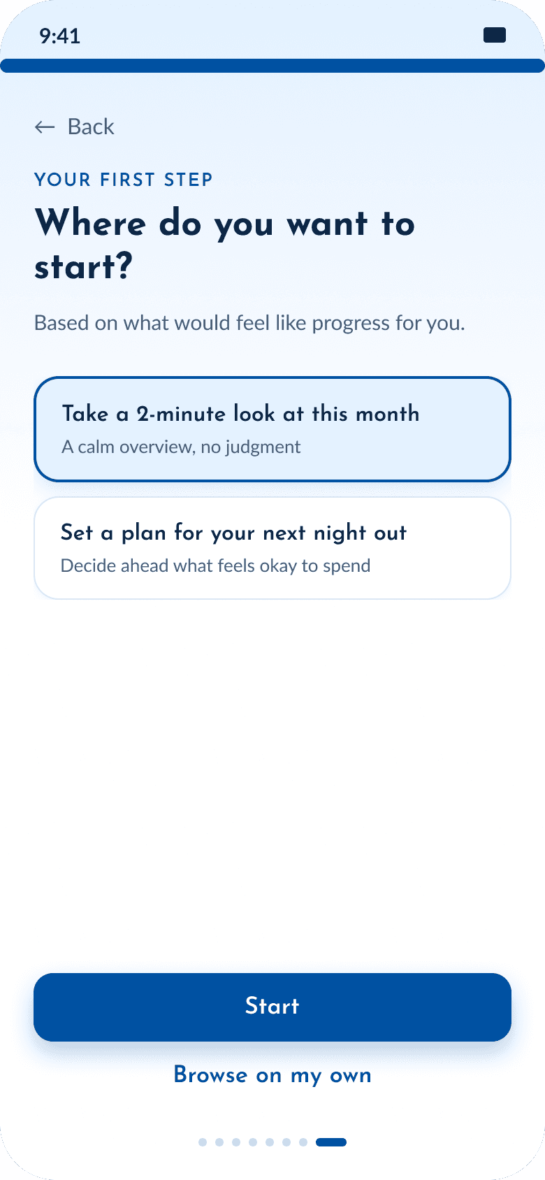
After / Reflective onboarding, in validation
Where it stands
Auro is in validation, with a clearer direction and 25 students on the waitlist. We don't yet have evidence it improves how students feel about or manage money.
Next, we'll test reflective onboarding against a simpler persona quiz, measuring whether students feel understood and can name a next step they'd actually take.
What I learned
A well-designed app can still fail the person using it. Designing for money means designing for how people feel when they look at it.
Thanks for stopping by!
Leah Benjamin © 2026
Portfolio
